Living Out
A fresh brand identity, animations and super robust new website
Living Out is a Christian charity helping people, churches and society talk about faith and sexuality.
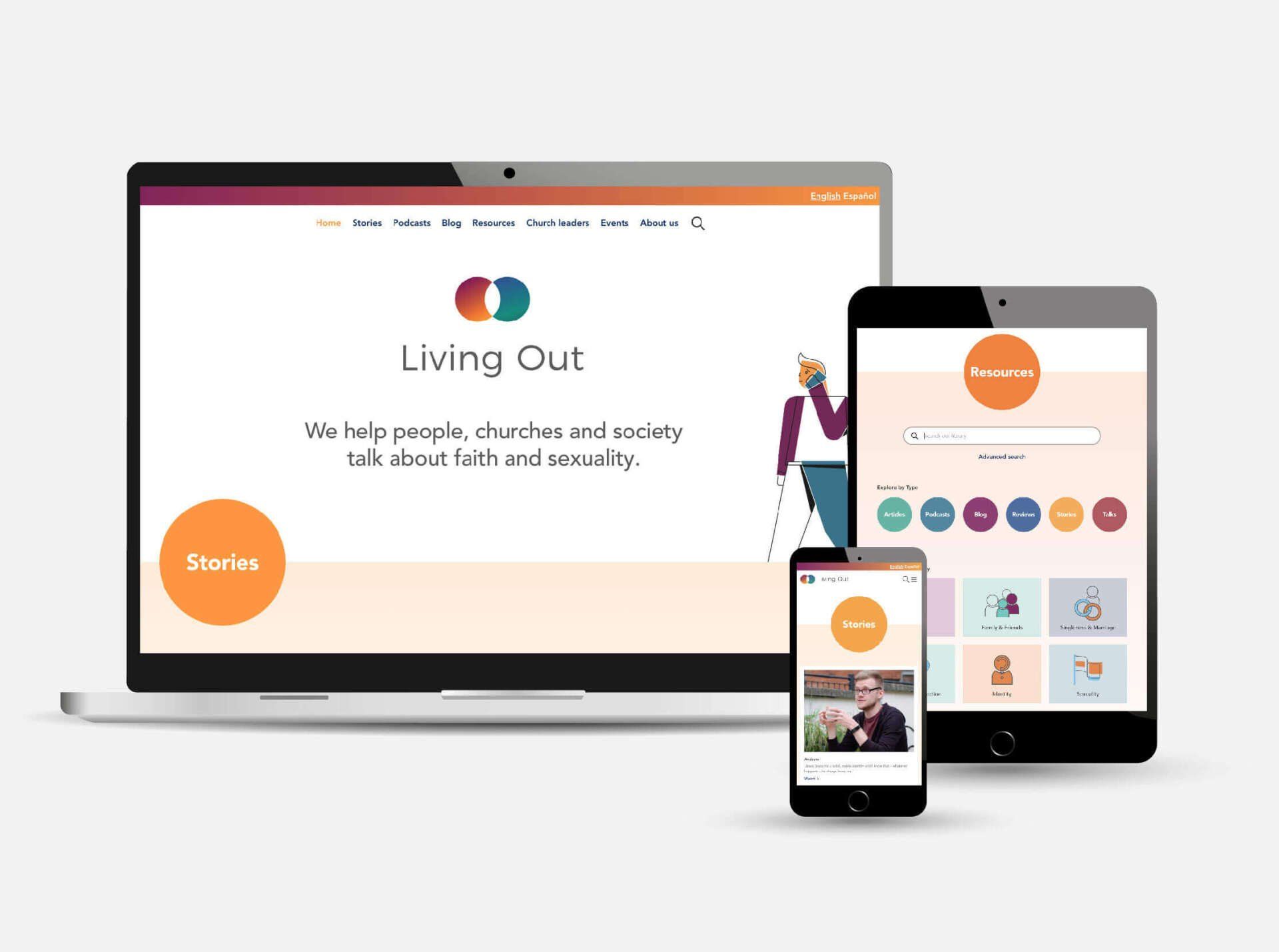
They needed a new brand identity and a new bespoke website, built to make sure all of their helpful resources were easy to find and access for everyone.
The new brand needed to be simple and versatile. During our discovery sessions, they highlighted that they often felt like they existed in the middle of a Venn diagram, so we created their new icon to celebrate this. Bright gradients were added to soften the geometric shapes, aiming for a sense of inclusivity while intentionally avoiding any colour combos already associated with personal identities.

Brand values
Trustworthy • Friendly • Authoritative • Compassionate • Respectful • Unashamed
With a new logo and a whole heap of freshly illustrated brand assets to work with, we built the website - designed with easy to navigate sections and a powerful search function. We also created a set of animations, which tell personal stories exploring faith and sexuality.

-
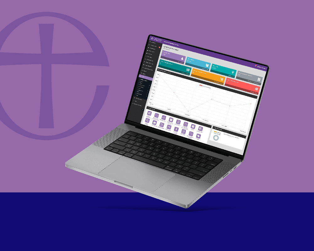
Church of EnglandFacilitating connections for churches across the UK
-
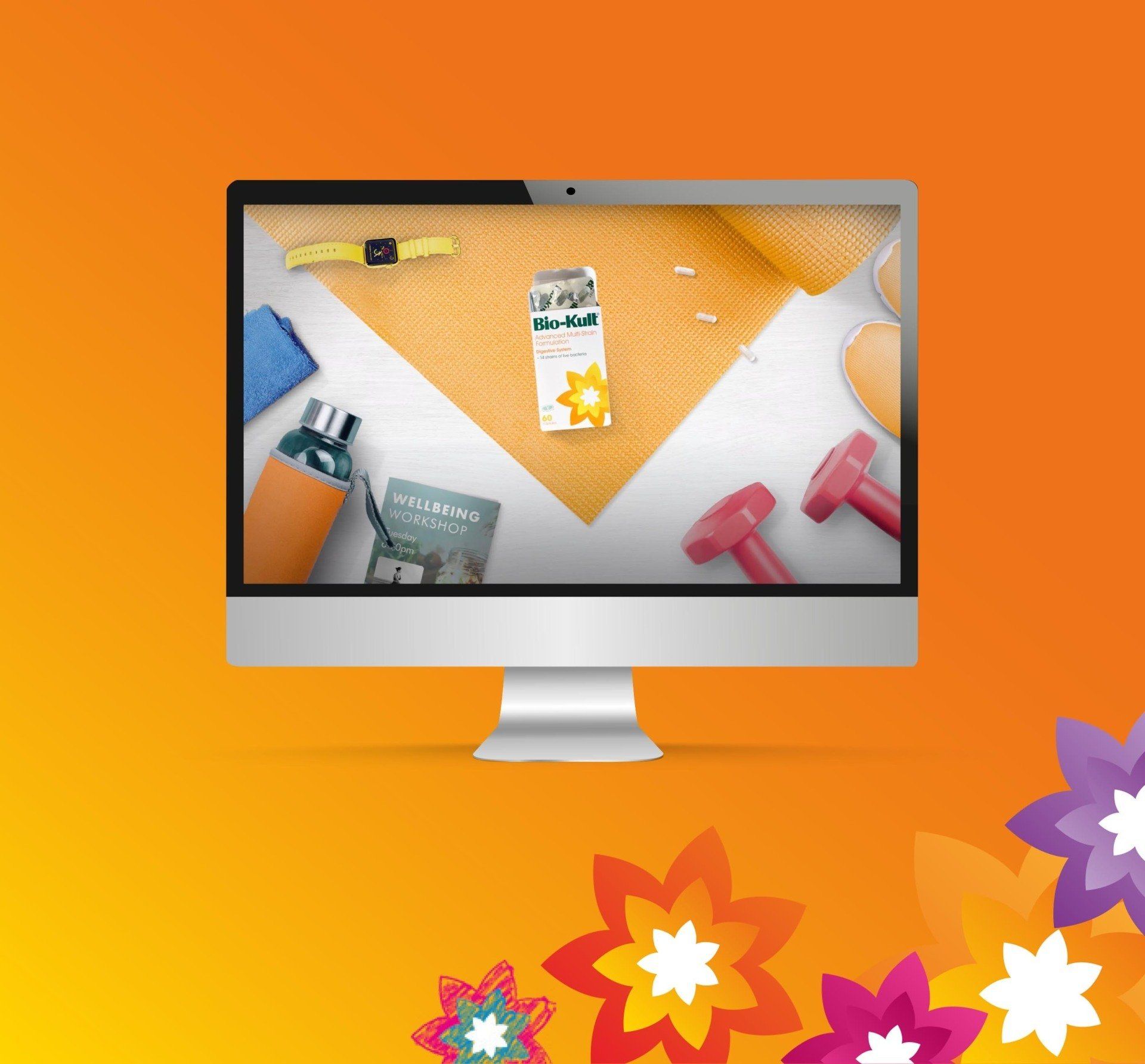
Bio-Kult ProbioticsBoosting sales with compelling animations
-
Eternal WallBrand & tech foundations for a national monument


